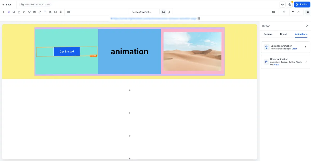
Buttons in the Page Builder can now respond when visitors hover over them. You can choose from built-in effects and adjust them from the sidebar without writing custom CSS.
What changed
Hover effect categories
Examples from the six effect categories include:
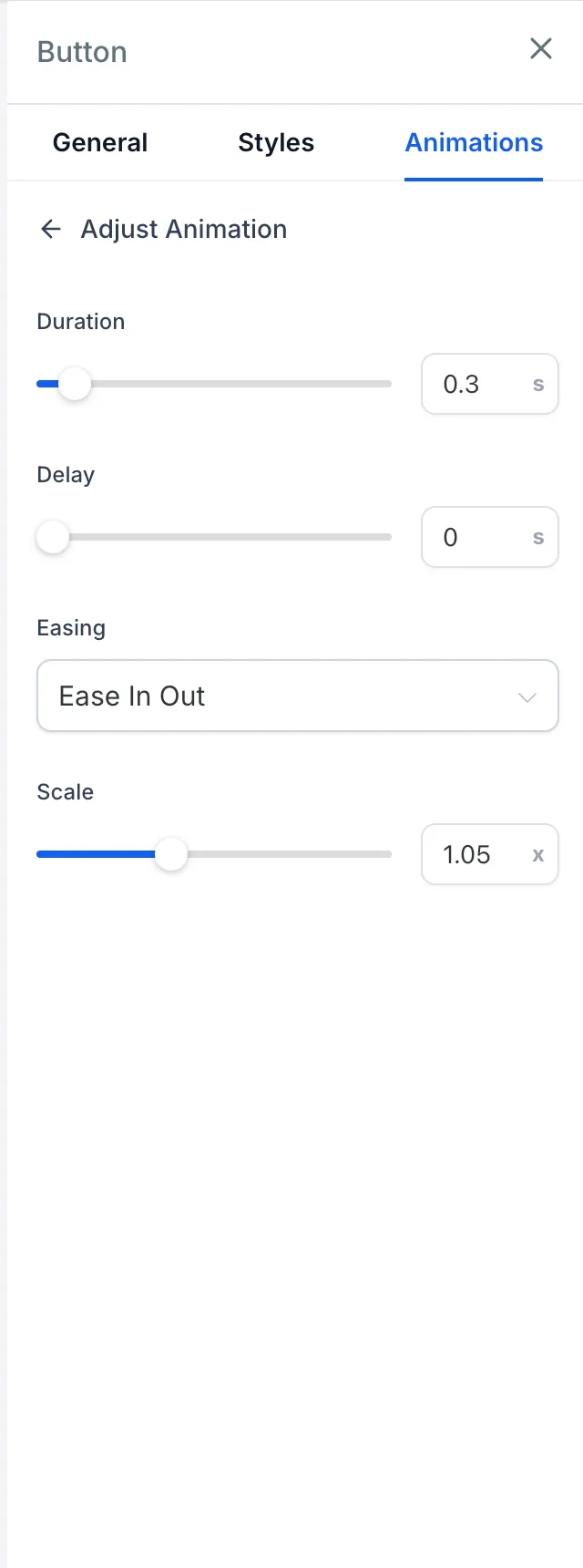
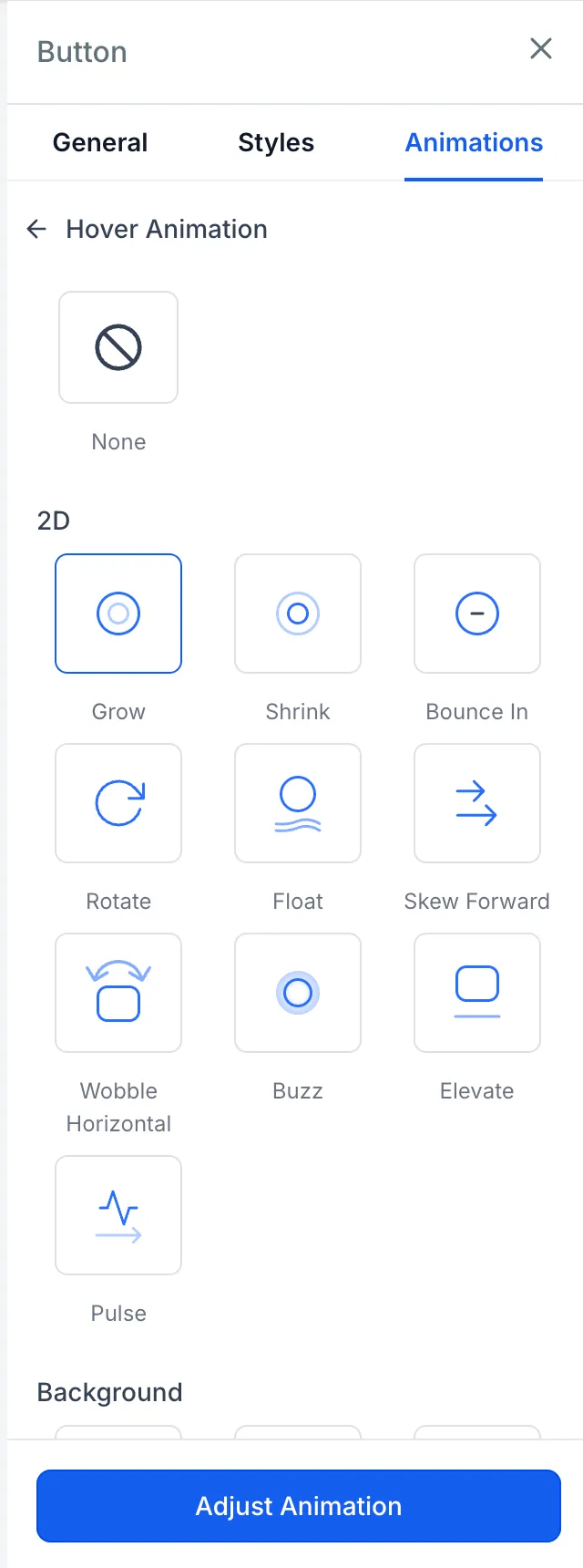
- Scale: Grow, Shrink, Pulse, Bounce In
- Rotation: Rotate, Skew Forward
- Movement: Float, Wobble Horizontal, Buzz
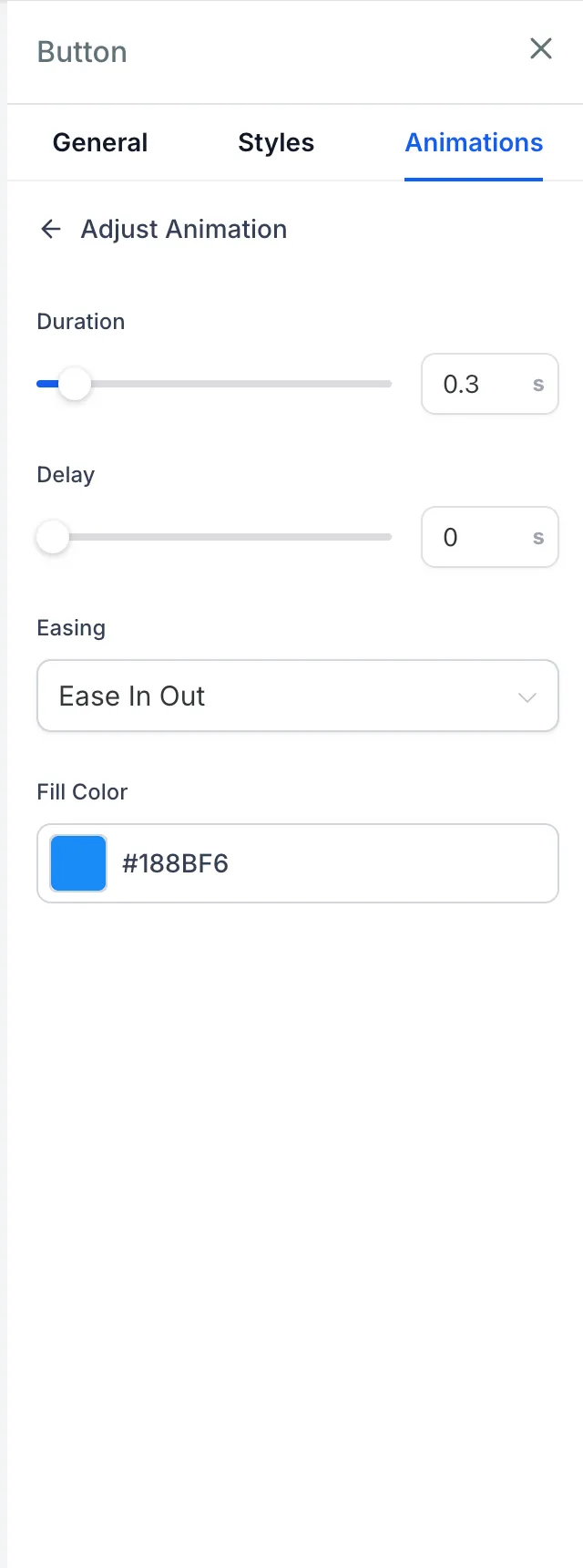
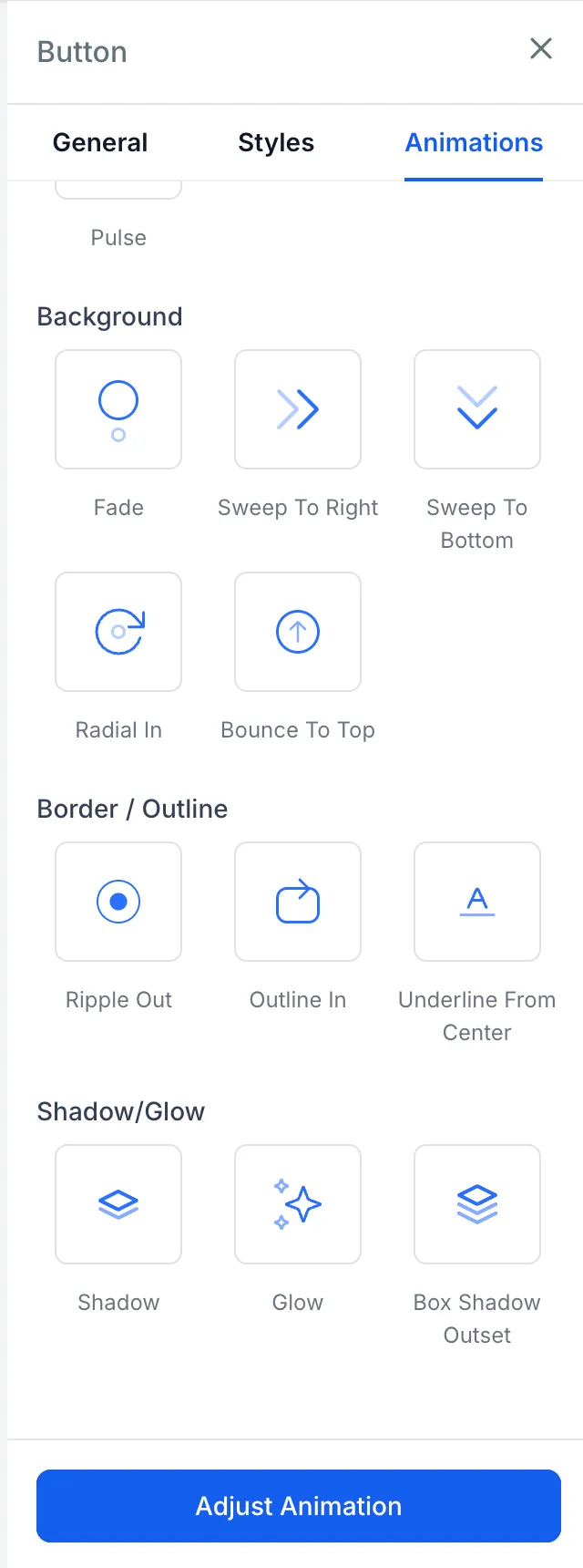
- Background: Fade, Sweep To Right, Sweep To Bottom, Radial In, Bounce To Top
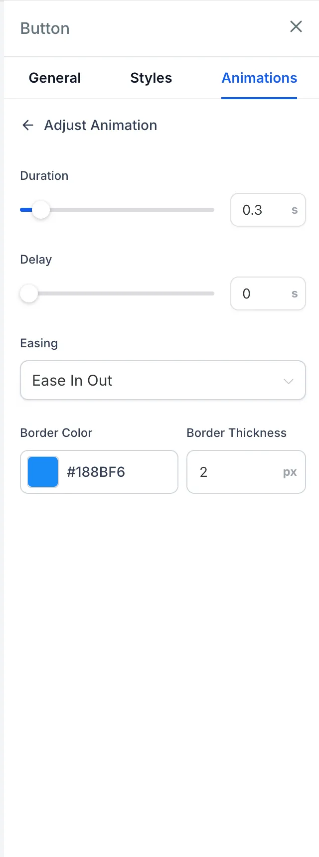
- Border: Ripple Out, Outline In, Underline From Center
- Shadow: Shadow, Glow, Box Shadow Outset
Live previews and sidebar controls
You can hover over an effect card in the sidebar to preview the animation on the selected button before applying it.
Each effect includes core timing controls:
- Duration: 0.1 to 3 seconds
- Delay: 0 to 5 seconds
- Easing: Linear, Ease-in, Ease-out, or Ease-in-out
The sidebar also shows only the settings that apply to the selected effect, such as scale factor, rotation angle, movement distance, fill color, border color, border thickness, shadow color, blur, and spread.
Device and animation behavior
Hover states automatically disable on touch devices and screen widths below 1024px to help avoid stuck hover states.
If a button already has an entrance animation, the hover effect waits until the entrance animation finishes before activating. Cloned elements, sticky bar buttons, and navigation duplicates mirror the hover behavior of the original button.
Entrance animations are also steadier on the canvas. They no longer replay during component remounts, such as drag-and-drop or device switching, and they wait until elements are visible on screen.
How to use it
- Open the Page Builder.
- Select a button on the canvas.
- Open the Animation tab in the sidebar.
- Go to Hover Animation.
- Hover over an effect card to preview it.
- Select an effect.
- Optionally adjust timing, color, scale, distance, border, or shadow settings in the Adjust panel.
Why it matters
This gives users a no-CSS way to add responsive button interactions in websites and funnels. It also keeps the editing interface focused by showing contextual controls only when they are relevant to the selected effect.
In Case You Missed It
For another builder-focused update, read Inline Schema Markup Validation in JSON View.
Release Images
Need Help Applying This Update?
Want help turning this update into a working part of your CRM, marketing, or automation setup?
Get Started or schedule a demo and we’ll help you map the right next step.
Explore this in SMBcrm
Connect a website visit to a useful next step.
Explore website and funnel tools, then plan the form, booking, or conversation that follows a visit.
Explore website and funnel toolsAlready using this feature? Find setup help