More Product Media Layout Options for Product Details Pages
SMBcrm now supports more ways to display product images on Product Details Pages. This gives merchants added flexibility in how product media appears across desktop and mobile storefront experiences.
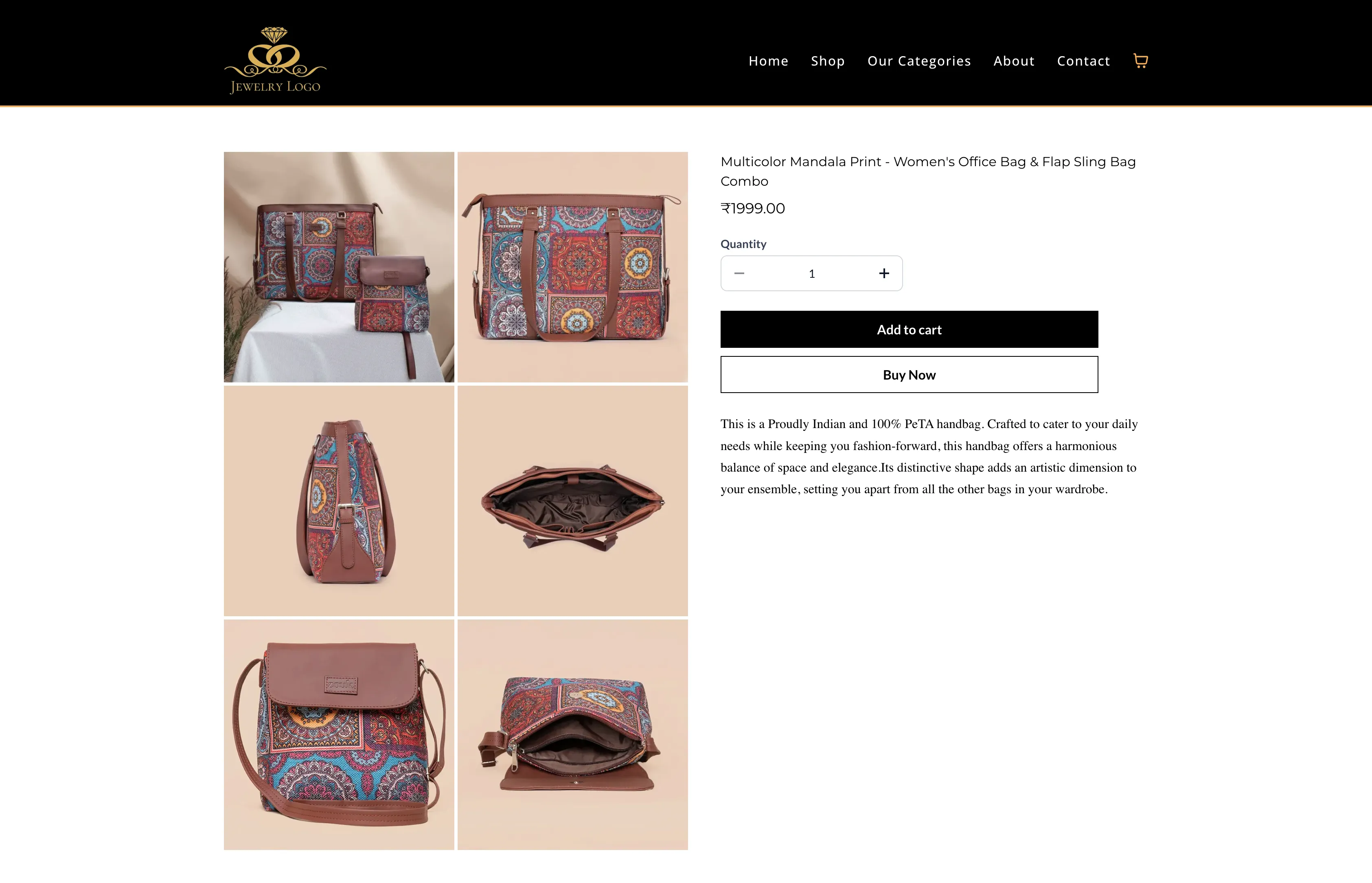
What Changed
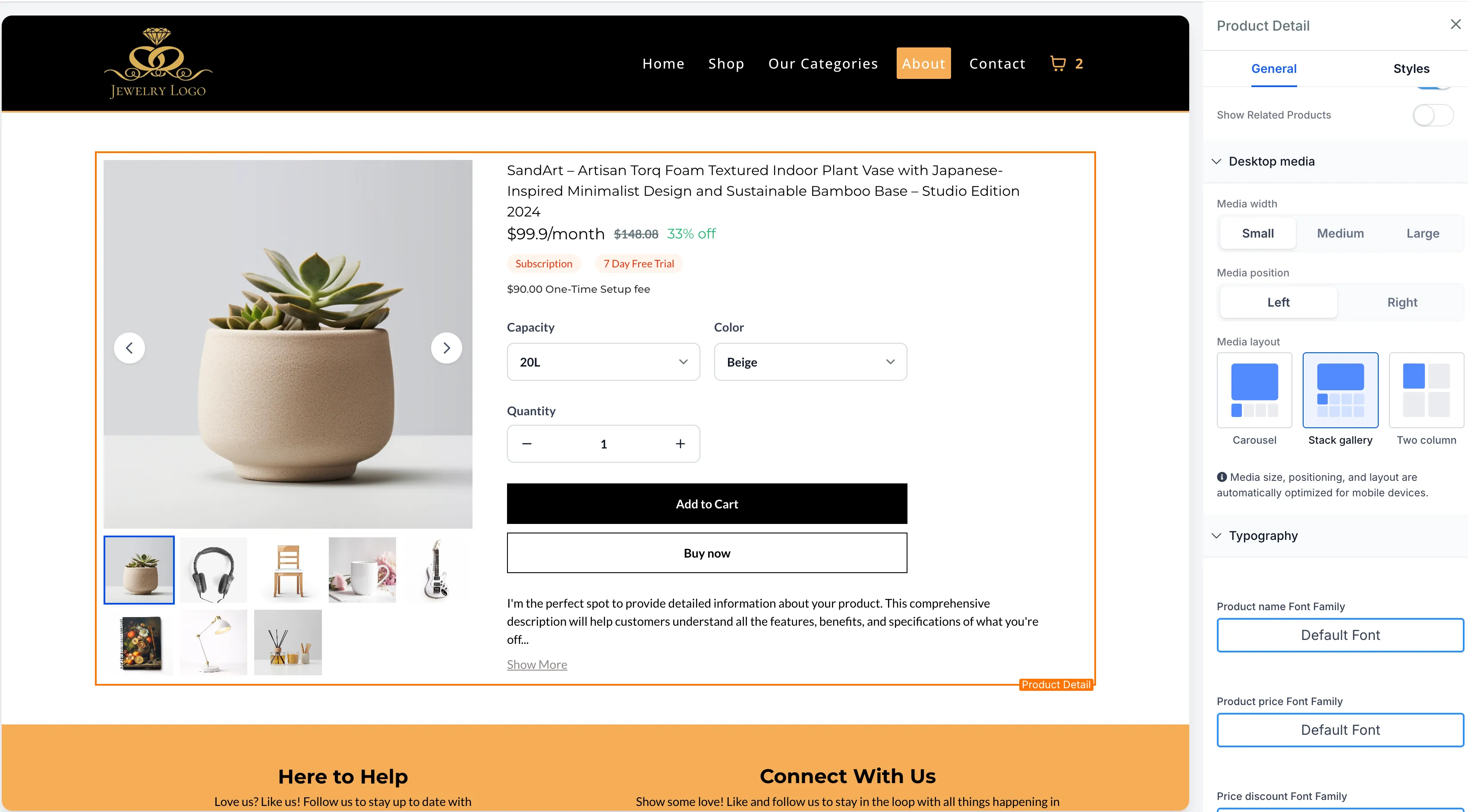
You can now choose from three desktop media layouts for product images on the Product Details Page:
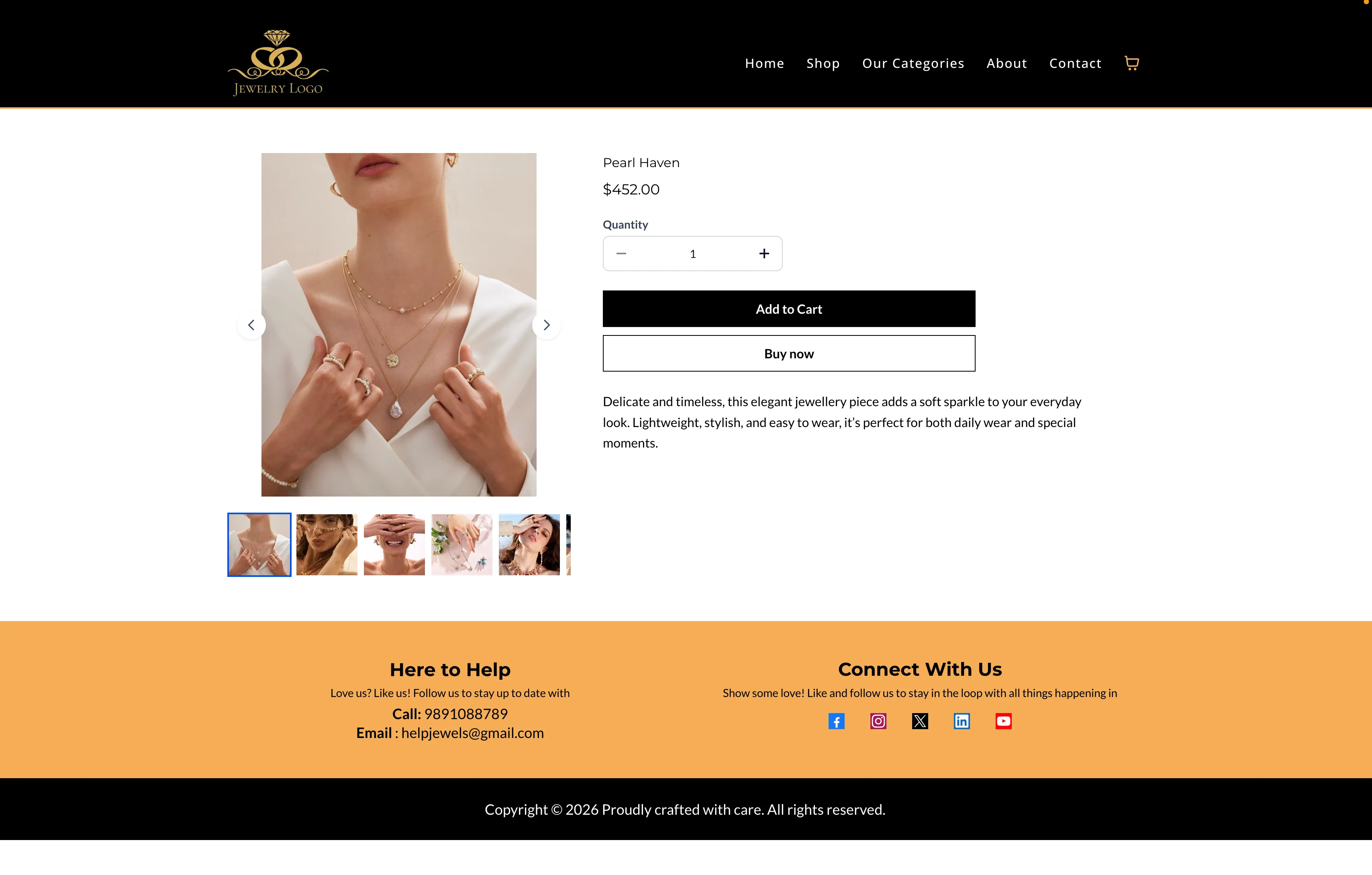
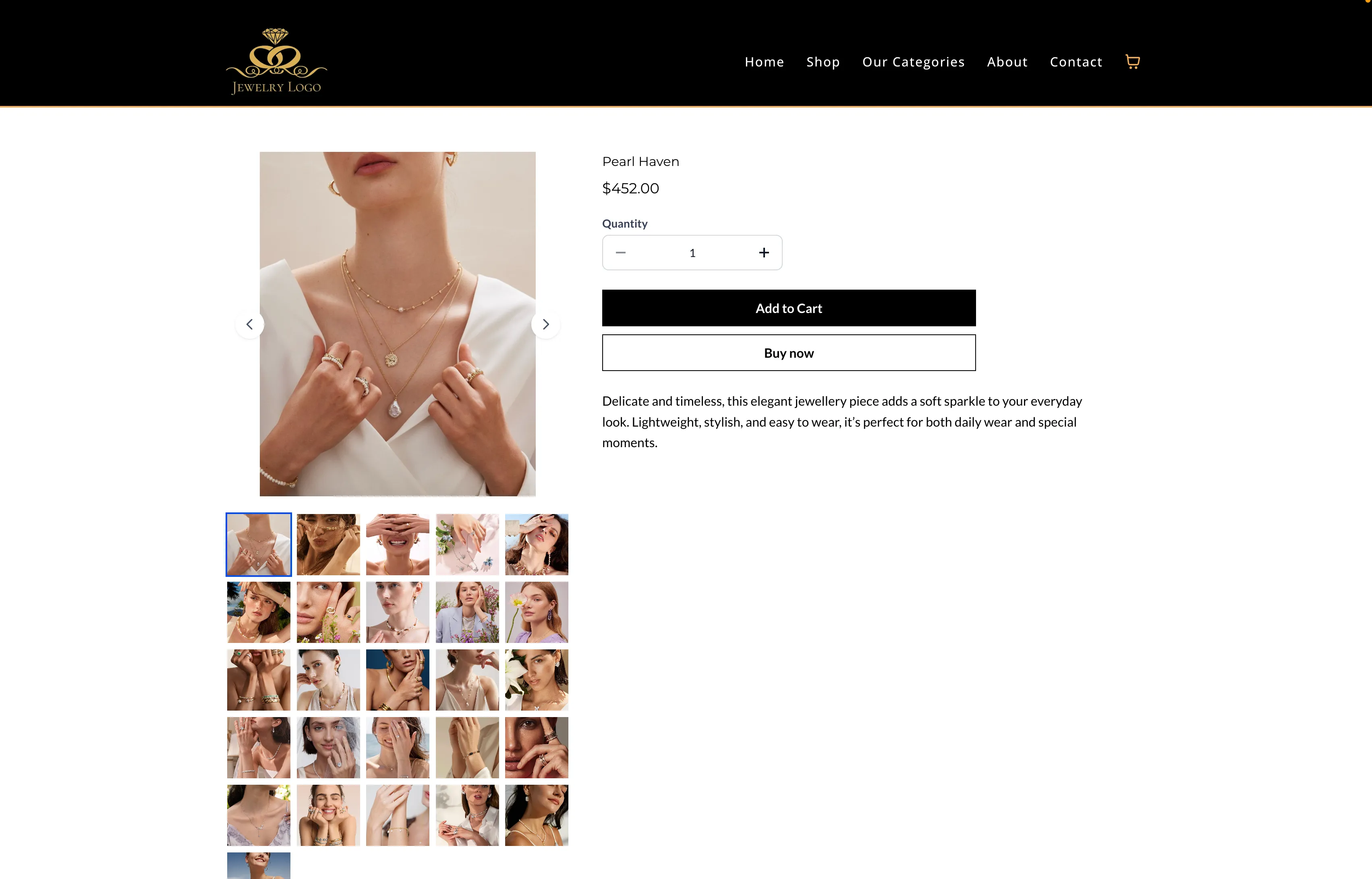
- Gallery: Vertical stacked image display
- Carousel: Horizontal image carousel with navigation
- Two Column: Desktop-only two-column grid layout for product images
Navigation arrows are available in the Gallery and Carousel layouts to make image browsing easier.
Mobile Behavior
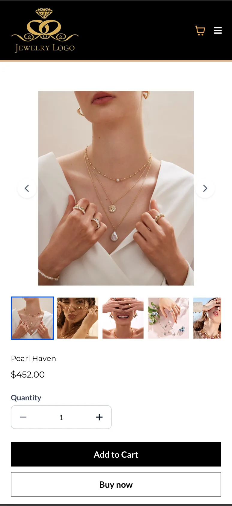
On mobile devices, the Carousel layout is automatically applied for both the Product Details Page and Featured Product elements for a better viewing experience.
The Two Column layout is not supported on mobile.
Featured Product Support
For Featured Product elements:
- Carousel and Gallery are supported
- Two Column is not supported
How to Use It
- Open Store Builder and edit the Product Details Page.
- Select the Product element.
- Open the Desktop Media settings in the right-side panel.
- Choose your preferred Media Layout: Gallery, Carousel, or Two Column.
- Save and publish your changes.
What to Keep in Mind
- Two Column is available on desktop only
- Carousel is used automatically on mobile, regardless of the desktop layout you choose
- Existing stores keep their current layout unless you change it manually
- Existing stores continue using Gallery by default for backward compatibility
In Case You Missed It
You can also read about ACH Bank Transfers for US and Canada Accounts Using NMI.
Need Help Applying This Update?
If you’d like help rolling this out in SMBcrm, visit Support or request a demo.